Streamlining a complex onboarding process
“We were facing a complex user flow and we were brought value and new perspectives through the design sprint. The pitch back to our team was polished and insightful, putting even some consultancies' work to shame.”
- Edward Straiton, Founder and Head of Product for Genehub
Table of contents
1.
2.
3.
4.
5.
6.
7.
Project Overview
Overview
Client
Edward Straiton
CEO and Founder of Genehub
Timeline
January 2023
2 week design sprint
Roles
UX Research
UX Design
UI Design with Figma
Team
Harold Prior-Palmer
Cecile Costerus
Zeb Cumberland
Company Background
Genehub is a med-tech start up that hopes to help patients find breakthroughs with their chronic illnesses by storing their genetic data and including it in unique research programs.
Brief
They wanted us to design a quick and easy sign up process for patients to get access to their platform. However in order to get access, patients needed to contact their GP for some obscure medical data codes which was by nature was never going to be quick and easy.
Although the product was not live yet, they feared massive drop off rates before patients had even got access to the platform.
Experience Map
Envisaging the experience
Because the product was not live yet I demoed the experience myself. I tried to make it as realistic as possible by both calling up and then going into my local GP surgery.
The insights gathered from the experience map were crucial in both:
Making sure we made our research questions relevant
Highlighting the biggest pain points of the onboarding process
Research
Research goal
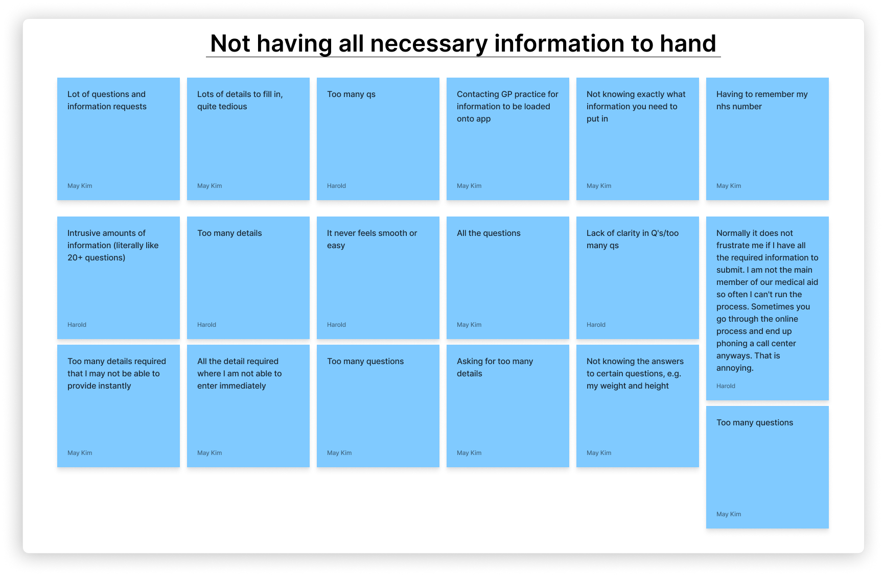
We conducted research on 103 people to understand the pain points of onboarding flows, get to know how patients would feel about sharing their medical data for research purposes and understand patients relationships with their GP.
85
respondents to online survey
18
in person interviews
Affinity mapping
Key insights that informed designs
Avoid using medical jargon as only 1% of people had heard of linkage key or national practice codes
40% of people say they already use healthcare apps like Patient access or Dr IQ which already contain online services codes
Keep the onboarding process as simple as possible with constant visibility of system status and always the option to save
Patients prefer to contact GP via text or email
User Personas & Problem Statement
User Persona 1
Sarah’s persona reflects users who will be least likely to drop out of the onboarding process due to either:
Already having the necessary online service codes on a given healthcare app
or
Having a good relationship with their GP who they will not be reluctant to contact
User Persona 2
Patricks’s persona reflects users who be most likely to drop out of the onboarding process due to:
Being easily frustrated by long and complicated sign up process’s
and
Being reluctant to contact their GP because of how unorganised and unresponsive they are
Problem statement
There is a high likelihood that users will drop out of the Genehub onboarding flow because of its complex nature of requiring information that users are unlikely to have heard of, let alone possess.
By providing users with a quick and easy onboarding process and providing them assistance in contacting their GP, we believe we can keep the drop off rate to a minimum. We will know this to be true when the sign up rate is above 80%.
Hypothesis
User Flows and Low- Fidelity Wireframes
During usability testing two things became clear.
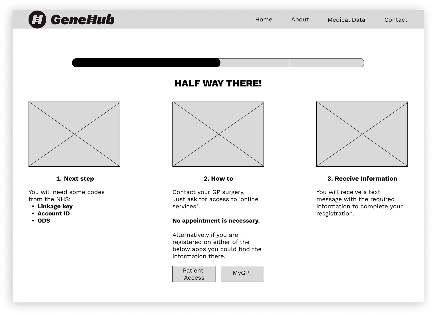
Asking users whether they already use a healthcare app like Patient Access should not be on the same page as asking users to contact their GP as it was information overload and led to confusion.
The on-boarding flow was going to need to be broken up into two separate flows as most people were likely to not get their codes from their GP quick enough to complete everything all at once.
User Flow Iteration
User Flow Before Changes
User Flow after Changes
Usability Testing
Overview
We conducted usability testing on 10 people and unsurprisingly the page that required the patient to get their online service codes caused the most frustration and ended up changing three times.
Draft 1
Feedback
People found that this page was information overload and crucially offered no assistance on how to actually contact their GP resulting in most people just saying they’ll do it another time.
Draft 2
Changes
With the second prototype we added a page that would sync someones GP contact details simply by putting their GPs postcode in.
We also made the language more simple by getting rid of convoluted lingo like linkage key and national practice code. This decision was backed up by our research as only 2% of people are likely to recognise these.
Feedback
People still found the page overwhelming and whilst the GP sync page made it easier to contact their GP, some people still couldn’t be bothered to do it at the time.
There was still room for improvement with regards to hand-holding patients through the process.
Draft 3
Changes
Here we made the option to get the online service codes from a healthcare app a completely different step that came prior to the contact GP page.
To help make the process even more efficient for those who emailed their GP, we designed a way to create a pre-drafted email that contained all the required information and automatically had their GP surgeries email address filled in.
Feedback
This test brought the fewest drop offs out of the flow.
There was still a little bit more room for improvement with regards to making the call to action for the pre-drafted email not only more obvious but the recommended option. This can be seen in the high-fidelity version.
High-Fidelity
We thought it crucial to send users a follow up email with a link to finish the onboarding process 72 hours later in case they had received their codes from their GP but had not bothered or forgotten to go back and finish importing their medical data on Genehub.
Results
Testimonial
“We were facing a complex user flow and we were brought value and new perspectives through the design sprint. The pitch back to our team was polished and insightful, putting even some consultancies' work to shame.”
- Edward Straiton, Founder and Head of Product for Genehub
Now Genehubs beta is live to a select group of patients, it is hugely rewarded to see that they have followed many of the ideas we developed during our design sprint, including:
Advising patients that they can find their online service details through certain healthcare apps like Patient Access.
Easy link to find what someones GP contact details are.
Having a pre-drafted email to send to their GP.
A follow up email 72hrs later.


